
Lust: based on the incidence of sexually transmitted diseases. Because lusty people have unsafe sex and spread disease. Research courtesy of the Bible Belt!
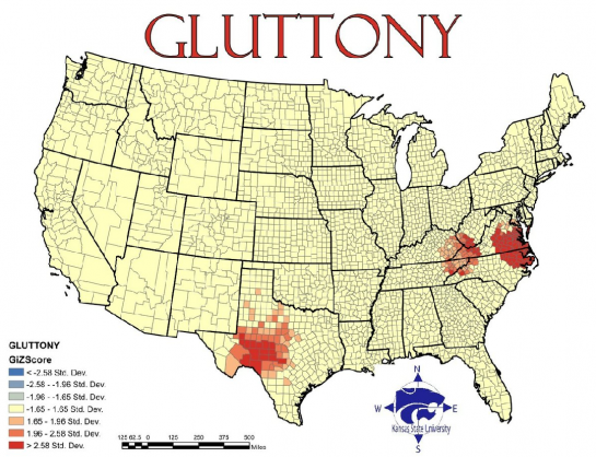
Gluttony: based on the number of fast food restaurants per capita... While I definitely get the correlation between gluttony and fast food (big, cheap and FAST!), perhaps an obesity map would have worked better? All this shows to me is the homogeneity with which fast food franchises have colonized the country.

Greed: reflects average incomes versus total inhabitants below the poverty line... This one I believe is flawed. I can't think of a way of combining these two statistics to come up with a measure that would at all correlate to or even connote greed. The map too seems to indicate that they are simply equating greed with prosperity.
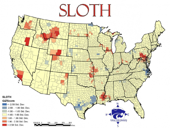
Sloth: reflects spending on arts, entertainment and recreation versus rate of employment... A bit uninspired, and ideologically flawed, but okay.

Wrath: reflects total violent crimes per capita. Sounds about right!

Envy: based on the total number of thefts... Seriously? San Francisco guiltier of envy than LA???
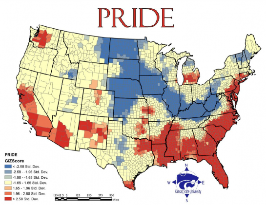
Pride: calculated as the average of the six other sins... because pride is the origin of all sins? Cop out.
So... I take it Heaven is full of mid-westerners.
Via Flowing Data and Revolutions.