Friday, November 6, 2009

Atheists visualized

I stumbled across this interesting graphic today, depicting four of our most prominent atheist (secular humanist) thinkers: Richard Dawkins, Daniel Dennett, Sam Harris and Christopher Hitchens.

The image groups them based on various (slightly arbitrary, but still very interesting) categories, highlighting some of their differences and commonalities. It certainly conveys a lot of information efficiently and elegantly.


Click here for a larger image, or check out the author's Flickr photostream.

Tuesday, November 3, 2009

The breathing earth

This is really fascinating -- and sobering. A real-time simulation of CO2 emissions by country called The Breathing Earth. And yes, the picture it paints is pretty dire.


Worth checking out!
The Breathing Earth

Thursday, August 20, 2009

Augmented reality: The future of maps?

I have no sense of direction. Seriously, I once walked around a circular plaza one and a half times before realizing that I was retracing my steps. I always imagine that functional humans have a sort of navigator in their head that allows them to orient themselves constantly and keep track of where they are now relative to where they were before. I'm not like that. I still get lost in my office building.

Which is why I love love love augmented reality, especially as it applies to mapping services.

Map/Territory from timo on Vimeo.


This would save my life!

Via Flowing Data.

Wednesday, August 19, 2009

Visualizing your online persona

Ever been curious about your online identity? Or, more specifically, how a computer algorithm with all its inherent limitations might perceive your online identity?

Enter Personas, a project by the Social Media Group from the MIT Media Lab:
"[Personas] uses sophisticated natural language processing and the Internet to create a data portrait of one's aggregated online identity. In short, Personas shows you how the Internet sees you.

"Enter your name, and Personas scours the web for information and attempts to characterize the person - to fit them to a predetermined set of categories that an algorithmic process created from a massive corpus of data. The computational process is visualized with each stage of the analysis, finally resulting in the presentation of a seemingly authoritative personal profile."

Okay, so this doesn't work for me because I am a virtual unknown with no online identity to speak of. I am an Internet Nobody, sad but true.

But I tested this out instead with one of my favorite Internet Somebodies: Richard Feynman (full disclosure: he was my longest lasting imaginary crush through high school). The results are quite funny...


Click the image to enlarge (sorry for the low res).

I have to say, I would never guess this was the online persona for a Nobel Prize winning physicist... The big sports component (yellow on the left) is to me most amusing. Run the algorithm and you'll see that it's due to a misinterpretation of the words "series" (in this case "lecture series" not sports series) and "player" (from the oft-reported fact that Feynman was a "bongo player" - really).

Of course, the smart kids at MIT were aware of this all along:
"Personas demonstrates the computer's uncanny insights and its inadvertent errors, such as the mischaracterizations caused by the inability to separate data from multiple owners of the same name. It is meant for the viewer to reflect on our current and future world, where digital histories are as important if not more important than oral histories, and computational methods of condensing our digital traces are opaque and socially ignorant."

Nifty stuff.

Tuesday, August 18, 2009

Rorschach paintings: From ink to art

Vesna Jovanovic is perhaps not your typical artist, and her works are most certainly not typical. Once an arts and chemistry double-major, she now draws inspiration for her paintings from nature, science and psychology.

Her most recent works? A series called "Pareidolia," in which she starts with a random ink spill, and then fills in the silhouette with meticulous drawings ranging from the organic to the mechanical: veins and neurons interlaced with glass-work and electronic wiring.


The title itself is genius:
"I eventually titled the series Pareidolia, a term used to describe the psychological phenomenon of recognizing specific, identifiable forms in otherwise random stimuli. Common examples of pareidolia are the recognition of animals in clouds or faces in wood grain, and it is the basis of the Rorschach test, the series of inkblots used by psychologists to gain insight into a patient’s mental state."

Indeed, the creative process itself works like an applied Rorschach test, turning an inkblot and its connotations for the artist into a work art.

Check out Jovanovic's portfolio here.
Via Seed Magazine.

Monday, August 17, 2009

EveryBlock: News visualization goes local

So... back to one of my favorite topics: visualizing news.

As I've mentioned a few times before, innovations so far in the space have been quite lacking. Often big and flashy, but of scant use to someone actually out looking to catch up on some news.

So here's a welcome change: EveryBlock is a hyper-local news site with a simple layout and visualization tools that look like they might actually come in handy.


It offers neighborhood-specific news feeds, a simple news map, and city stats such as police calls, liquor license status changes, and restaurant inspections. It's also available as an iPhone app, which I'll be sure to check out.

It's definitely a good start and I like that their focus is clearly on utility.

Not surprising therefore that it was recently sold to MSNBC, which is at least trying to come up with some creative solutions to revitalize the online news space. Check out their Spectra Visual Newsreader while you're at it. I still think it falls into the category of More Flashy Than Useful, but at least it's a step in a different direction.

Curious to see how EveryBlock will fit in.

Monday, August 3, 2009

Order in randomness

Random Walk asks a curious question: What does randomness look like?

Through a collection of beautiful visualizations, it reveals the strange interplay between chaos and order within seemingly random phenomena, like rice grains falling, or the digits in the number Pi.

The latter in particular I find really interesting. Plotted as a random walk, where the value of each decimal determines the direction of a fixed-length step, Pi traces a path evocative of a fractal.


Definitely worth checking out.

Wednesday, July 29, 2009

Truth

"As mathematicians, we play and dream but we don't cheat. You can't cheat in mathematics. Truth is so important. To solve a problem with a proof is exciting and rewarding because it is true forever." ~Marie-France Vigneras

I miss that about my days studying math... Nothing to spin.

Via Seed Magazine.
Their whole slide show on photographs of mathematicians is worth checking out.

Thursday, July 23, 2009

Why cheap airlines are cheap

As someone who grew up in Europe with the luxury of an EasyJet flight from Milan to London for under 50 Euros, the exorbitant prices of U.S. airlines (even the so-called cheap ones) are a constant source of bafflement and frustration.

In case you've wondered how certain airlines can profitably keep prices their prices so low, this visual makes it very clear.


And true, many of the cost reductions come from doing more of what we all hate about airlines: cramming more seats and offering less perks. But piling into an overcrowded tin cylinder without so much as a bag of peanuts to distract me from the crying baby two rows back wouldn't be half so bad if it didn't come with a $500 price tag.

I am all about no frills flights, just as long as they're actually cheap.

Oh, and to American Airlines who insists on recycling its blankets until they are so sticky and strewn with hair that I am afraid of touching them: enough with that already. Just get rid of them. Half-assed perks are far worse than no perks at all.

Via flowingdata, which I am clearly obsessed with.

Self-tracking through Twitter

Data data data. Especially, our own.

From Nike shoes that allow you to log your miles on an iPhone app, to that kid on Twitter who feels compelled to tell the world how many laps he swam each morning, self-monitoring seems to be the latest fad. I track, therefore I am.

And while there is no shortage of tools available to our inner OCD, one in particular stands out in my mind: your.flowingdata.

Created by UCLA PhD candidate Nathan Yau as part of his thesis on self-surveillance, your.flowingdata allows users to aggregate personal data through daily tweets, and then visualize it in various different formats, including graphs, treemaps and word clouds.


Obviously, as a closet obsessive-compulsive and data visualization fan, I am more than a little intrigued so I've started tracking one simple aspect of my life: my moods and their intensity during the workday (since that's when I'm mostly on Twitter).

Yes, I realize I have picked perhaps the least objective metric possible, but that's half the fun. I'm curious as much about my moods as to what might affect my perception of and decision to report on them.

More updates on that to come.

In the meantime, you can read more about your.flowingdata here.
Also, here's an older post on visualizing music consumption, another cool thing to track.

Tuesday, June 16, 2009

Art from paper

Simon Schubert makes art simply by folding paper, and the results almost unbelievable.


It's amazing what a sheet of paper and a serious dose of imagination can create.

Check out this earlier post for some more paper-based inspiration.

Via today and tomorrow.

Saturday, June 6, 2009

Of money and morality


A little while ago I posted about site called YourMorals.org, which uses responses to various quizzes as data for research on moral psychology, and since then I've been taking a bunch of their tests.

This has afforded me such encouraging insights as: I am significantly less satisfied with my life than the average test-taker, I am more likely than average to react to things with disgust, my morality is essentially about avoiding harm and preserving freedom, and I take serious issue against authority and purity. Go figure.

But there's one test in particular that caused me to pause: the "Sacredness Survey".

It works like this:
You are presented with various hypothetical acts (burning your country's flag, pricking a child's hand...) that might violate notions you hold "sacred" and you are asked what it would take for you to engage in these acts. Your response options are the following:
  • $0 (I'd do it for free)
  • $10
  • $100
  • $1,000
  • $10,000
  • $100,000
  • A million dollars
  • Never for any amount of money

So, at risk of revealing myself as the freak that I am, here were my results -- and it should be noted that this applies only to the acts that I said I would do: it excludes things I wouldn't do for any sum of money.
  • It would take an average of $0 to get you to violate the HARM foundation.
  • It would take an average of $5000 to get you to violate the FAIRNESS foundation.
  • It would take an average of $33333.333333333 to get you to violate the INGROUP foundation.
  • It would take an average of $0 to get you to violate the AUTHORITY foundation.
  • It would take an average of $0 to get you to violate the PURITY foundation.

Creepy right? I sound like a cheap psychopath.

But this is where I think the study is flawed, or at least very ill-suited to my personal brand of morality...

When it comes to morality and "sacredness", if there's something that doesn't bother me, then I need no financial compensation to do it. In fact, I will gladly break a taboo just for laughs.

One that tickled me from the survey: Sign a piece of paper that says "I hereby sell my soul, after my death, to whoever has this piece of paper." Sure, I'll do that for free for the sheer irony of it.

However, when it comes to things I won't do, like pricking a child's hand (back to my harm-based personal morality), then typically no amount of money will convince me to do it, not because I'm so honest I can't be bought, but because getting paid for doing something bad makes it worse, not better. I may regret harming a child, but getting paid to harm a child is something I might never be able to live down. And the greater the fee the more immoral the act.

Who knows... I guess it's my relationship with money that's coming into play. I have no problem getting paid for work done or services rendered (heck, I have a job after all!), but getting paid to do something bad is a whole other story. So basically, I think my personal financial hang-ups are creating "noise" in my responses to that survey, confusing the results.

I my mind, the major flaw with this survey is that is assumes a commensurability between money and morality, as if the costs of one could be compensated by the benefits of the other. However, money itself has huge moral connotations for most people and it's wrong to think one could introduce that into the equation without fundamentally changing the game.

Tuesday, June 2, 2009

Quizzes for a cause

Ever been curious about the fundamental underpinnings of your personal moral code? Or how you stack up against others in the moral spectrum? Or how morality affects your daily behaviors?

Take the quizzes offered on YourMorals.org and your answers will be added to the body of knowledge informing current research on moral psychology.

Plus, the tests are wonderfully addictive.

Tuesday, May 19, 2009

The world in miniature

Okay, bear with me here, because when I first saw this, I thought it was about how to take photographs of miniature model landscapes - something I'd much rather leave to the more arts-and-crafty among us. But that's not what this is about.

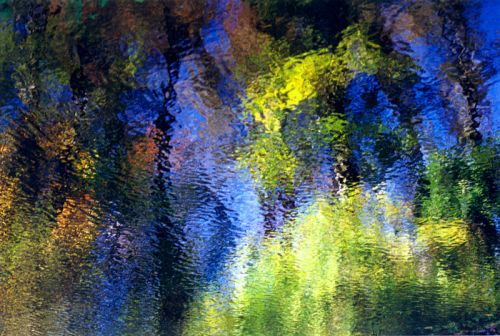
This is about taking an ordinary photo, say of a real city or landscape, and making it look like it's depicting miniature models. Like the photo below... Toy boats on a miniature lake, right?


Nope, it's actually just a doctored image of a real life coastal landscape.

Trivial? Useless? Maybe, but check out how it's done.

TiltShiftMaker
is a site that does just that, and it does it very simply, by just reducing the depth of field of the photo: the portion of the photo that looks sharp and in-focus. Turns out, the shallower the depth of field, the smaller and closer the objects in a photo look, to the point of making real landscapes and buildings look like nothing more than miniature models.

The reason this works is that when we look at something small and close to our eyes, the portion of our field of vision that is in focus is very small. Conversely when we look at something very large and far away, the potion that is in focus is actually much greater. So when we notice a shallow depth of field, regardless of what we're really looking at, our brain signals SMALL and CLOSE (rather than BIG and FAR) and we use this to make a determination as to what we might be looking at - for example, tiny model boats as opposed to a life-size coastal landscape.

What fascinates me about this is that we do this entirely unconsciously. I didn't know anything about photography or depths of field before looking into this -- in fact I had to wiki depth of field to make sure I was talking about the right concept. But on some level, my brain did know. It's just one thing among a huge quantity of information that we unconsciously process in order to make deductions about the world around us from what is essentially a pretty limited set of sensory perceptions.

Here's other related example - it's a pretty common optical illusion.
Look at the image below... Concave or convex?


To virtually everyone the left side looks like buttons, while the right side looks like shallow holes. The interesting question, however, is why.

The answer is that we make the determination based on how the disks are shaded, interpreting the colors as light and shadow. If there is one thing we know intuitively (though perhaps not fully consciously) about light is that it tends to come from above - from the sun or from lamps. So a disk that is lighter on top we interpret as a protruding button catching light from above, whereas a disk that is darker on top we interpret as a hole shaded from above and catching light on the bottom.

In a way our minds are incredibly ingenious at noticing patterns in our perceptions and using them as clues to navigate the world around us, basically making educated guesses along the way.

But know enough about how the mind works, and you can easily trick it!

Via Apartment Therapy.

Art down the rabbit hole

A philosophy major turned artist, Maggie Taylor depicts a whimsical world that looks like something Lewis Carroll might have dreamed up had Alice's adventures through the looking glass led her into Monty Python's flying circus.


Check out Maggie Taylor's website for more about the artist and her quirky gorgeous works.

Wednesday, May 13, 2009

United Sins of America

Theoretically interesting, but sketchy in its execution: geographers from Kansas State University create visual maps of the prevalence of the seven deadly sins across the U.S. using various statistics as a (tenuous) proxy for the country's sinfulness.


Lust: based on the incidence of sexually transmitted diseases. Because lusty people have unsafe sex and spread disease. Research courtesy of the Bible Belt!


Gluttony: based on the number of fast food restaurants per capita... While I definitely get the correlation between gluttony and fast food (big, cheap and FAST!), perhaps an obesity map would have worked better? All this shows to me is the homogeneity with which fast food franchises have colonized the country.


Greed: reflects average incomes versus total inhabitants below the poverty line... This one I believe is flawed. I can't think of a way of combining these two statistics to come up with a measure that would at all correlate to or even connote greed. The map too seems to indicate that they are simply equating greed with prosperity.


Sloth: reflects spending on arts, entertainment and recreation versus rate of employment... A bit uninspired, and ideologically flawed, but okay.


Wrath: reflects total violent crimes per capita. Sounds about right!


Envy: based on the total number of thefts... Seriously? San Francisco guiltier of envy than LA???


Pride: calculated as the average of the six other sins... because pride is the origin of all sins? Cop out.


So... I take it Heaven is full of mid-westerners.

Via Flowing Data and Revolutions.

Tuesday, May 12, 2009

A world inside a book

Brian Dettmer is an American artist, mostly known for his works involving alterations of existing media: books, maps, records, audio casettes...

Among his most fascinating pieces are his book carvings, turning ordinary books into sculptures and revealing their content as a three-dimensional work of art.

This one is entitled Science in the Twentieth Century.


Check out more of Dettmer's works on Flickr.

Found through Centripetal Notion.

Monday, May 11, 2009

Mad science?


While many people's reaction to this is likely to be outrage at the money we're wasting, In This Economy, researching pipe-dream theories... this is actually the sort of thing I love.

Wired Magazine outlines six of the most out-there fields being studied today.

My three favorites?
  1. Precognition (Daryl Bem, Professor Emeritus of Psychology, Cornell University)
  2. Disembodied Consciousness (Edward Kelly, Research Professor of Psychiatry and Neurobehavioral Sciences, University of Virginia)
  3. Telekinesis (Garret Moddel, Professor of Electrical, Computer and Energy Engineering, University of Colorado at Boulder)
Seriously, if there's a future out there where these notions become reality, sign me up!

Check out the article here.

The future of news visualization: Still waiting

Since my recent post about the inadequacies in current means of presenting news, I've stumbled upon another news site that seemed worthy of mention: MSNBC's Spectra Visual Newsreader.

And sure, it's visually intriguing, and surprisingly easy to use. It lets the user select specific interest areas, and then surfaces related news with a combination of text and images.


But still... I'm not convinced that translating news into a vortex of color-coded flashcards qualifies as a significant advancement in the field. It looks nifty at first, but it's not innovative in any meaningful way.

So yeah: no.

Sunday, May 10, 2009

Loftcube: Experimental temporary home design

Back to blogging about design...

Looking for a super-minimalist solution for temporary housing? Then consider the Loftcube concept: a small, compact, exquisitely designed living space constructed in the form of a lightweight cuboid. So lightweight in fact, that it could be transported from place to place via helicopter.


Loftcube is the brainchild of Berlin designer Werner Aisslinger.

And while I don't understand how they solve the problem of providing water and electricity to the unit (not to mention a functioning sewage system!) without compromising its mobility, it sure is a wonderfully creative bit of utilitarian design!

Thursday, May 7, 2009

Individuality?

A wise person once said, "There are only about 100 people in the world. The rest are just mirrors."

If this rings true or at least interesting, then check out this photography site.
"They call their series Exactitudes: a contraction of exact and attitude. By registering their subjects in an identical framework, with similar poses and a strictly observed dress code, Versluis and Uyttenbroek provide an almost scientific, anthropological record of people's attempts to distinguish themselves from others by assuming a group identity."


If you've ever questioned the fundamental premise of a group culture based on individual originality, this one's worth checking out.

Sunday, May 3, 2009

The future of news visualization

So I've been spending some time thinking about how news is conveyed, and I'm thinking we have room for some serious innovation...

Pick up a newspaper and what do you see, at a very first glance? Words. Black type on white. An image or two. Perhaps a big headline catches your eye and you read it; it registers in your mind as Big News. You read a few more articles. Now you know a subset of today's news, but little more.

Seems to me that a whole lot of information is falling through the cracks, and online news sources are not much better. Google News tried to create a richer news experience, by aggregating news from different sources and by organizing stories topically, but it wasn't a huge improvement.

Here are a few more interesting approaches:

Newsmap.jp I just discovered today, and it's quite smart: it displays all news on a single screen, color-coded by topic, with the biggest stories occupying the most real estate. The user can either search for a specific story, or filter based on topic, recency and geography.


Another conceptually interesting news site is BreakingNewsMap, which pinpoints breaking news on a world map in real time...

Unfortunately, despite its theoretical coolness, in practice it's too scattered and conveys information far too slowly (just one story every couple of seconds), so the user gets no sense for the big picture. I could imagine idly following it for a minute or so, but I would get frustrated pretty quickly.

What I want to see is a combination of the two... I like the idea of putting news on a map, but I want to see more stories at once, color-coded based on topic, featured more or less prominently based on how much buzz they're generating. I want to be able to apply filters to my news. I want to zoom in from national/world news to local and hyper-local news. Oh, and I want images too!

All you geniuses out there, make it happen!

Smile! Your future marriage might benefit!


A recent study, excerpted in The Economist, draws a possible connection between high school yearbook photos and divorce rates. As it turns out, the less people smile in their yearbook photos, the more likely they are to divorce later in life.

So... happy kids end up in happy marriages?

Or, considering the misery of high school for so many of us, is grinning for the camera just an indicator of one's ability to smile through the pain?

I am in a cynical mood today.

Sunday, April 26, 2009

Bed in a cube!

Don't know about you, but I'm a big sucker for unusual design.

Plus, this one gives a whole new meaning to the the concept of "jumping into bed!"


Read more about this studio design by architects Emmanuel Combarel Dominique Marrec on Apartment Therapy. And while you're at it, check out the whole site -- it's my favorite design blog.

Thursday, April 23, 2009

Tetris furniture...?

Love or Hate?


Check out more Tetris-inspired design here.

Tuesday, April 21, 2009

The remotest places in the world

If there's one thing I've gained from my sad corporate existence, it's a renewed appreciation for remote places. I think they appeal to the escapist side of me.

So if you're also dreaming of a little escapism from the hustle and bustle of your daily grind (can I fit any more cliches into this sentence?) then this map might come in handy.


It's a world map color-coded based on accessibility by travel, and you can read more about it here.

See you in Greenland!

Seeing is believing!

This one's a bit dated, but it's truly priceless and I couldn't resist!

Imagine a quaint county courthouse, in rural Tennessee, and imagine that its surrounding grounds have been designated as a sort of "free speech zone" -- a space open to outdoor displays and installations of all sorts. What might you expect to find there?

Well, as it turns out: a soldiers' memorial, a Statue of Liberty, a cross-bearing Jesus, a chainsaw-carved sculpture of monkeys and bears, and...

...wait for it...

...a Flying Spaghetti Monster!


To those of you unaware of the deep significance of the Flying Spaghetti Monster, get thyself an education.

To everyone else, may you be touched by his noodly appendage!

You can read more the county courthouse and its inadvertent encounter with Pastafarianism here.

And while you're at it, do treat yourself to the open letter to the Kansas State Board of Education that started it all.

Bleeding jobs

Nothing like starting the day with a little dose of depression, but this interactive map on Slate Magazine really drives the point home.

Yup, we're bleeding jobs all over the place, and you can see clearly what areas have been hit the worst.

Click here to view the interactive version.


Hopefully we'll get to see this republished once the situation finally improves.

Monday, April 20, 2009

Hearing sights, seeing music

I wish I had synesthesia!

It's a neurological "condition" (minus the negative connotations), affecting about 4% of the population, in which cognitive and sensory pathways "cross over" one another, leading to an unusual "blending" of perceptions.

Sight gets mixed in with hearing, hearing with taste and so on... One might experience blue as not just a color, but also as a taste; or the sound of a cello as inherently "green", not simply as a metaphor, but because the visual experience of "green" accompanies the auditory experience of the sound in a very real and literal way.

It's fascinating stuff and truly makes one wonder about the possible differences among people's perception of the world.

So if this has sparked your interest, here are two interesting articles on synesthesia:

In this interview, neuroscientist David Eagleman talks about the synesthesia gene and the The Synesthesia Battery, a free online test for synesthesia aimed at promoting scientific progress in the field.

Even more fascinating: consider synesthesia from the perspective of art. Artist and synesthete Marcia Smilack creates photographs and videos to recreate some of her visual-auditory sensations for non-synesthetes. You can read about her in this Seed Magazine article, The Most Beautiful Painting You've Ever Heard.

Also, check out Smilack's portfolio here.

Sunday, April 19, 2009

Follow-up review: RjDj


So I finally caved and bought an iPhone, taking a big ole swig from the collective jug of kool-aid. Oh but it tastes so good!!

And, it gave me the opportunity for a follow-up review to my original post about that quirky RjDj app. Quick reminder:

"RjDj takes in sounds from your surroundings (voices, street noise, tapping on computer keyboards...) and plays it back to you as music compositions in real-time."

That's how I had described it the first time around.

Having now sampled it first hand, I'll revise that description. It's not so much music as a stream of psychedelic-sounding repetitions, as if a sound, rather than merely being heard and registered by your brain, instead lingered there a bit longer, bouncing off the sides of your skull and creating weird reverberating echos.

So... music, no.

But it is extremely interesting and weird and fascinating. I had it running while I was unloading the dishwasher, and the clanking of dishes (among my top 10 most annoying sounds) somehow turned into a strangely fitting noise-pop soundtrack to that most mundane of activities.

There's certainly more that can be done with the app, including sampling different "scenes," which are essentially different algorithms for manipulating the sound inputs.

I'll do some more exploring and post a follow-up if I discover anything nifty.

Check out the app here, and my original post here!

Thursday, April 16, 2009

Of icons and iconoclasms

Great article in The Economist's Intelligent Life magazine.

The topic: the word "iconic". And it manages to draw a parallel between Jesus, Hitler, Stalin, stadium rock and Marmite, all in the first sentence!

Enjoy!

Sleep: simplifying synapses?


A recent study seems to support the controversial theory that sleep preserves brain function by weakening or even severing connections between brain cells.

Counter-intuitive, at the very least.

Scientist theorize that this weakening in synapses serves to "save resources ... and boost the signal of important memories over the noise of unneeded connections." It basically clears up the brain for new thoughts and memories.

The findings are by no means certain - indeed there have been past studies suggesting the precise opposite: that sleep strengthens rather than weakens synapses. However, it's still and interesting thought.

It also echoes a similar and equally surprising finding in urban planning: that removing roads and traffic lights actually speeds up traffic. Whether you buy into the roads/synapses analogy, it's a fun article to read: touching upon all sorts of topics from mathematics to economics to game theory.

For more on sleep and synapses, check out this digest on Discover Magazine's blog.

Monday, April 13, 2009

Trauma and the spotless mind


Seems like selective memory deletion is really the hot topic of debate nowadays, and obviously I am fascinated. This recent article, on Wired Magazine, touches upon the possibility of using memory editing drugs to treat post-traumatic stress disorders (PTSD) in soldiers.

The moral and ethical issues related to memory-editing drugs of course are numerous, and I've touched on a few of them before. My question here is a more practical/functional one...

On a very simplistic level, the case for using memory deletion to treat PTSD is that absent the negative memories from which they originate, the stress symptoms will subside. However, I wonder if there are cases in which knowing and dealing with the source of one's anxiety might in fact be the best way to cure it... Exposure therapy, for example, has proven fairly effective in treating PTSD.

Consider also this article in Scientific American, which suggests that PTSD is over-diagnosed among soldiers, when depression or social and reintegration problems might be equally to blame. In these situations it's hard to imagine that memory editing could possibly be a solution.

Nothing but flowers

At New York's Nyehouse gallery, Alexis Rockman's exhibit depicts an eerie, post-apocalyptic world dominated by plants and animals -- beautiful, but strange, like three-eared rabbits and conjoined daisies.

According to Rockman:
“In my mind, that had to do with mutation and pesticides... The idea of the perfect lawn.”


Check out the slide show and commentary on Seed Magazine.

Thursday, April 2, 2009

Movies worth seeing

This week my Netflix queue bestowed upon me two very unusual French films: The Diving Bell and the Butterfly, and La Moustache. One thing I like about Netflix is that, since I tend to set up my queue on a whim, when the DVDs finally arrive in my mail I am almost always surprised (and, on occasion, appalled by my own lack of taste). And often, as in this case, they are films I know very little about.

On this occasion, it turns out that I was entirely unprepared for what was to come.


The Diving Bell and the Butterfly is the story of Jean-Dominique Bauby, once an editor of Elle Magazine, who suffered a serious stroke and found himself not only fully paralyzed save for his left eye, but a victim of "locked-in syndrome." He could hear and see as normal but was incapable of speaking, gesturing, or communicating with the outside world in any way other than by blinking his one functioning eyelid. The Diving Bell and the Butterfly is the book he wrote about his experience living life as a prisoner in his own body. To do this he had to painstakingly dictate the entire text one letter at a time to a transcriber who would say the alphabet until Bauby blinked, indicating what letter he wanted.

It's a tragic but fascinating film, well worth watching and all the more incredible considering what it must have been to live with such a condition. Bauby passed away just days after the book was published.


La Moustache is an altogether different story, in which a man who sported a mustache all his life finally decides to get rid of it, only to discover that nobody can tell the difference. In fact, everyone seems to believe that he never even had a mustache in the first place, sending him into a serious crisis of identity. Things get even stranger as more of his beliefs about himself and his life are called into question, causing him to doubt his own sanity and his life to rapidly unravel.

The tone feels very much like Kafka, with the angst that comes from feeling trapped in a dysfunctional world where everything seems to make sense to everybody except you.

So, though perhaps not the best cure for cubicle-induced cabin fever (unless schadenfreude is your cup of tea), both film are nonetheless highly worth seeing.

Monday, March 30, 2009

Adventures in selection bias


I always love a naughty research study, and this one sounded like fun: Spanking 'brings couples together'...

Researchers at Northern Illinois University measured stress hormone levels in couples engaging in S&M activities, and found evidence that these activities, while causing some anxiety at first (which, I suppose is the point, right?) ultimately left the couples feeling closer.

And what was their research sample? People attending an S&M party.
Yes. Really.

So... S&M brings couples who are into S&M closer? You don't say!

Saturday, March 21, 2009

Sweden Does Space Tourism

As early as 2012, tourist flights to space will be launching from Kiruna in Northern Sweden. Among the attractions: the possibility of flying through the aurora borealis, and catching a glimpse of the Northern Lights from space.

Which, I have to believe, must be one of the most amazing sights ever...


Flights will be operated by Virgin Galactic, and tickets will be available for $200,000 from the nearby Ice Hotel.

Read more about Swedish space tourism here.

Wednesday, March 18, 2009

Visualizing Bedroom Banter

This may come in useful next time you're at a loss for words in the bedroom...


You're welcome!

Click the image for a larger version.

Extreme Sheep LED Art

This is brilliant!


I'm not entirely sure it's real, but I think it is and it makes me happy to believe. Enjoy!

Monday, March 16, 2009

The 1.4 million dollar question...


French physicist and philosopher of science Bernard d'Espagnat has been awarded the John Templeton Foundation's prestigious and highly generous Templeton Prize, amounting to 1 million British pounds. It's the world's largest annual prize.

As for what Monsieur d'Espagnat has done to deserve such a prize, I'll begin by noting that his scientific pedigree is off the charts. Known for his work in quantum mechanics, d'Espagnat enjoyed the tutorship of Louis de Broglie who was his thesis advisor, he was Enrico Fermi's research assistant, and he worked under Niels Bohr at CERN.

Yet he was awarded the Templeton Prize less for his advancements of the field of quantum mechanics, than for his exploration of its philosophical implications. The Foundation's press release offers this telling quote by d'Espagnat:

"[Quantum mechanics allows for] the possibility that the things we observe may be tentatively interpreted as signs providing us with some perhaps not entirely misleading glimpses of a higher reality and, therefore, that higher forms of spirituality are fully compatible with what seems to emerge from contemporary physics.”

It seems that the 1.4 million dollar question has ventured way off the path of science and into the territory of religion and spirituality. And I'm not sure how I feel about this.

On the one hand, at a time when our economic hardships are driving us to reduce everything to a cost benefit analysis, and the humanities are falling further and further out of favor, it's nice to see a purely theoretical endeavor rewarded. I also think we would benefit from mending the current massively unproductive rift between science and religion.

But on the other hand, is this really the 1.4 million dollar question? Or is there some truth to Richard Dawkin's critique that the Templeton Prize is just "a very large sum of money given...usually to a scientist who is prepared to say something nice about religion?"

I may be leaning toward the latter...

Alice's Adventures in Microscopic Wonderland

Three beetles sip tea at a table made of butterfly wings, set in a field of crystallized vitamin C while aphids fly overhead, and it looks every bit as fanciful as Lewis Carroll's world beyond the rabbit hole.


This image, by illustrator Colleen Champ and microscopist Dennis Kunkel, was among the first prize winners at the 2008 International Science and Engineering Visualization Challenge.

Read more about it on Wired Magazine and on the contest website, where you can see other fascinating images that blur the lines between science and art.

Monday, March 9, 2009

Pencil Sculptures

Jennifer Maestre is an artist from South Africa who makes sculptures out of everyday objects like pencils and nails. Spiky sculptures! Inspired by sea urchins!

Thursday, March 5, 2009

Robots, Love, Babies


Kenji, a third-generation humanoid robot, was originally programmed to emulate the human emotion of love, but ended up emulating dependence and fear of abandonment instead.

"After some limited environmental conditioning, Kenji first demonstrated love by bonding with a a stuffed doll in his enclosure, which he would embrace for hours at a time... Researchers attributed this behavior to his programmed qualities of devotion and empathy and called the experiment a success.

...

"The trouble all started when a young female intern began to spend several hours each day with Kenji, testing his systems and loading new software routines. When it came time to leave one evening, however, Kenji refused to let her out of his lab enclosure and used his bulky mechanical body to block her exit and hug her repeatedly."

Nope, looks like Kenji wasn't displaying devotion and empathy at all.

Interestingly, his behavior is surprisingly similar to the first steps of social-emotional development in babies. At around 8-10 months, babies begin to show signs of human attachment, mostly in the form of separation anxiety, and only later do they acquire the capacity of empathy and an understanding of social rules.

So maybe Kenji just needs to grow up?

The story gets funnier:

"The intern was only able to escape after she had frantically phoned two senior staff members to come and temporarily de-activate Kenji."

Would have loved to see that. You can read more about Kenji here.

Tuesday, March 3, 2009

Visualizing the Patterns of Poetry

While browsing through Lee Byron's website, another interesting visualization project caught my eye. I've linked to his website before, on a post about visualizing personal audio histories. This one instead is about visualizing poetry in terms of repetition patters.

It always helps that Byron's visuals are so aesthetically appealing -- it makes them even more captivating. Check this one out...


It uses visuals to highlight different levels of patterns in a limerick: large yellow arcs capture the higher-level structure of the poem; narrower purple arcs capture patterns among words, like rhymes and alliteration; the bars along the bottom denote the number of syllables in each line.

If you look closely you notice even more patterns that add complexity to the visual.

I would have loved to see something like this when learning the structure of poems in grade school. Lessons on meter and "perfect" vs. "feminine" rhymes always seems so dreary and hard to remember, especially in contrast to the musical nature of poetry.

Speaking of music... I could see really interesting applications of this sort of visual to music, particularly from the Baroque period -- pieces like Bach's fugues that rely so much on patterns and repetition.

Check out more of Byron's poetry visualizations here.

Monday, March 2, 2009

Happy Birthday Dr Seuss!

Dr Seuss turns 105 today!

And with all the fear- and misery-mongering going on these days, it's as good a time as ever to think about what crazy, colorful, exciting, trippy things the future might hold.

Monday, February 23, 2009

A chain reaction across 8 cities, 6 time zones and 3 continents

Drop a coin in a gumball machine in Palo Alto and, a while later, you receive your gumball, except this happens by way of a kicking skeleton leg in Chicago, a ball bouncing off a sub-woofer in Munich, a pouring tea-pot in Shanghai, and countless steps more, involving everything from a Tickle-Me Elmo doll to a floating pillar of bubbles.

This feat of engineering is the brainchild of global design company IDEO, ranked as one of the 10 most innovative companies of 2008 by Fast Company, and it's worth checking out.

Yes, clocking in at 14 minutes, it's a bit much to watch in one stretch, but keep it running in the background and check in on it once in a while. It's absolutely fascinating.


IDEO Global Chain Reaction from IDEO Labs on Vimeo.

For more on possibly the world's largest Rube Goldberg machine, check out the article on IDEO Labs.

Nate Silver Botches Oscars, Blames "Huge Jackass" Mickey Rourke


As it turns out, stats golden boy Nate Silver's forecasts for last night's Oscars were correct only on 4 out of 6 counts. He missed on Best Supporting Actress (Penelope Cruz won over Taraji P. Henson) and on Best Actor (Sean Penn won over Mickey Rourke). He blogs about the outcome on FiveThirtyEight.com, and delivers a few gems in the category of sour grapes:

On Mickey Rourke losing Best Actor: "It probably doesn't help to be a huge jackass (like Mickey Rourke)... But is this information helpful for model-building? Probably not. (Unless perhaps we had some way to quantify someone's jackassedness: Days spent at the Betty Ford Center?)"

Liveblogging
13 minutes after missing Best Supporting Actress: "Remember when the Oscars used to be interesting and the Super Bowl used to be boring?"

Incidentally, the categories where he failed where two that I had guessed correctly, but my thought process in coming up with those guesses had absolutely nothing to do with statistics.

This in contrast to presidential elections, which are an inherently statistical process, and where anyone's guess on who might win inevitably involves some form of probabilistic reasoning...

Along these lines, it would be interesting to know more about Nate Silver's methodology and how it compares to his electoral model, but I haven't been able to find this information. Would welcome any leads...