Showing posts with label data. Show all posts

Thursday, July 23, 2009

Self-tracking through Twitter

Data data data. Especially, our own.

From Nike shoes that allow you to log your miles on an iPhone app, to that kid on Twitter who feels compelled to tell the world how many laps he swam each morning, self-monitoring seems to be the latest fad. I track, therefore I am.

And while there is no shortage of tools available to our inner OCD, one in particular stands out in my mind: your.flowingdata.

Created by UCLA PhD candidate Nathan Yau as part of his thesis on self-surveillance, your.flowingdata allows users to aggregate personal data through daily tweets, and then visualize it in various different formats, including graphs, treemaps and word clouds.
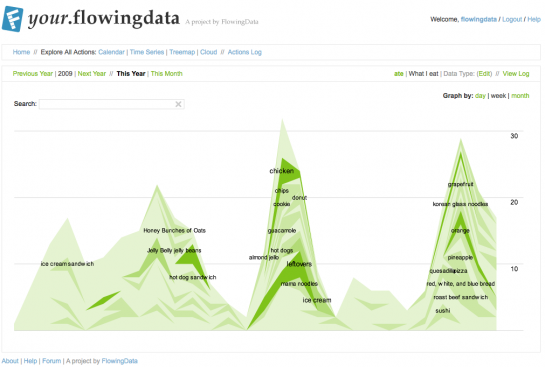

Obviously, as a closet obsessive-compulsive and data visualization fan, I am more than a little intrigued so I've started tracking one simple aspect of my life: my moods and their intensity during the workday (since that's when I'm mostly on Twitter).

Yes, I realize I have picked perhaps the least objective metric possible, but that's half the fun. I'm curious as much about my moods as to what might affect my perception of and decision to report on them.

More updates on that to come.

In the meantime, you can read more about your.flowingdata here.
Also, here's an older post on visualizing music consumption, another cool thing to track.

Tuesday, January 13, 2009

Growth of Walmart

I told you I liked data visualization gimmicks... This one shows the growth of Walmart across the U.S.


I wish I some cool video to juxtapose to this. Like the spreading of a virus...

Click through to see the full animation in all its viral glory.

Visualizing Personal Audio Histories

I'm always a sucker for a clever data visualization project -- anything that turns an unwieldy mass of information into a clean and intuitive graphic. The "aha!" moment is my favorite.

I'm also a huge music fan so here's one that sparked my interest.
Lee Byon, an information designer at Facebook, created this graphic to map his listening history on Last.fm.


Unfortunately all I have is a partial screen shot, so definitely click through to the article to get a better view.

Here's how it works: imagine time as the horizontal axis; each ribbon represents a different artist, color-coded based on how long the creator has been a fan (cool blues represent old favorites, while warmer colors represent newer discoveries); the width of the ribbon represents the volume of music heard.

What I love is how much information is immediately apparent. First of all, I like this guy's taste in music, but he seems a little boring: he mostly listens to old favorites -- though he seems to have gotten more experimental since. His listening habits tend to come in phases: there are times when he listens to a lot of music and times when he listens to fairly little; he seems very into particular artists at certain times, but they seldom make a comeback once he tires of them.

Would love to see my own audio history graphic, and compare it to those of my friends. I'm imagining a whole world of music histories that flow in and out of each other like liquid, intersecting, affecting each others musical currents.