Showing posts with label data visualization. Show all posts

Sunday, January 3, 2010

Naughts illustrated

Happy new year, and happy new decade! That is, if you're one of those people who start counting at zero. But considering that we already ushered in the new millennium one year too early, and that the past ten years (the Naughts, is that what we're calling them?) have been pretty dismal overall, I think we're all ready to start afresh.

The millennium is growing up, hitting puberty, soon to be an awkward and unruly teenager. Who knows what we can expect?

In the meantime, enjoy the New York Times' pictorial recap of 2000-2009 in matrix form. See where we're been, and how far we've come: from IM-ing to crowd-sourcing, from Enron to stimulus packages, from Pokemon to Lady Gaga.


See the full image here.

Friday, November 6, 2009

Atheists visualized

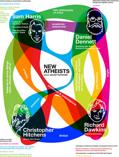
I stumbled across this interesting graphic today, depicting four of our most prominent atheist (secular humanist) thinkers: Richard Dawkins, Daniel Dennett, Sam Harris and Christopher Hitchens.

The image groups them based on various (slightly arbitrary, but still very interesting) categories, highlighting some of their differences and commonalities. It certainly conveys a lot of information efficiently and elegantly.


Click here for a larger image, or check out the author's Flickr photostream.

Tuesday, November 3, 2009

The breathing earth

This is really fascinating -- and sobering. A real-time simulation of CO2 emissions by country called The Breathing Earth. And yes, the picture it paints is pretty dire.


Worth checking out!
The Breathing Earth

Wednesday, August 19, 2009

Visualizing your online persona

Ever been curious about your online identity? Or, more specifically, how a computer algorithm with all its inherent limitations might perceive your online identity?

Enter Personas, a project by the Social Media Group from the MIT Media Lab:
"[Personas] uses sophisticated natural language processing and the Internet to create a data portrait of one's aggregated online identity. In short, Personas shows you how the Internet sees you.

"Enter your name, and Personas scours the web for information and attempts to characterize the person - to fit them to a predetermined set of categories that an algorithmic process created from a massive corpus of data. The computational process is visualized with each stage of the analysis, finally resulting in the presentation of a seemingly authoritative personal profile."

Okay, so this doesn't work for me because I am a virtual unknown with no online identity to speak of. I am an Internet Nobody, sad but true.

But I tested this out instead with one of my favorite Internet Somebodies: Richard Feynman (full disclosure: he was my longest lasting imaginary crush through high school). The results are quite funny...


Click the image to enlarge (sorry for the low res).

I have to say, I would never guess this was the online persona for a Nobel Prize winning physicist... The big sports component (yellow on the left) is to me most amusing. Run the algorithm and you'll see that it's due to a misinterpretation of the words "series" (in this case "lecture series" not sports series) and "player" (from the oft-reported fact that Feynman was a "bongo player" - really).

Of course, the smart kids at MIT were aware of this all along:
"Personas demonstrates the computer's uncanny insights and its inadvertent errors, such as the mischaracterizations caused by the inability to separate data from multiple owners of the same name. It is meant for the viewer to reflect on our current and future world, where digital histories are as important if not more important than oral histories, and computational methods of condensing our digital traces are opaque and socially ignorant."

Nifty stuff.

Monday, August 17, 2009

EveryBlock: News visualization goes local

So... back to one of my favorite topics: visualizing news.

As I've mentioned a few times before, innovations so far in the space have been quite lacking. Often big and flashy, but of scant use to someone actually out looking to catch up on some news.

So here's a welcome change: EveryBlock is a hyper-local news site with a simple layout and visualization tools that look like they might actually come in handy.


It offers neighborhood-specific news feeds, a simple news map, and city stats such as police calls, liquor license status changes, and restaurant inspections. It's also available as an iPhone app, which I'll be sure to check out.

It's definitely a good start and I like that their focus is clearly on utility.

Not surprising therefore that it was recently sold to MSNBC, which is at least trying to come up with some creative solutions to revitalize the online news space. Check out their Spectra Visual Newsreader while you're at it. I still think it falls into the category of More Flashy Than Useful, but at least it's a step in a different direction.

Curious to see how EveryBlock will fit in.

Monday, August 3, 2009

Order in randomness

Random Walk asks a curious question: What does randomness look like?

Through a collection of beautiful visualizations, it reveals the strange interplay between chaos and order within seemingly random phenomena, like rice grains falling, or the digits in the number Pi.

The latter in particular I find really interesting. Plotted as a random walk, where the value of each decimal determines the direction of a fixed-length step, Pi traces a path evocative of a fractal.


Definitely worth checking out.

Thursday, July 23, 2009

Why cheap airlines are cheap

As someone who grew up in Europe with the luxury of an EasyJet flight from Milan to London for under 50 Euros, the exorbitant prices of U.S. airlines (even the so-called cheap ones) are a constant source of bafflement and frustration.

In case you've wondered how certain airlines can profitably keep prices their prices so low, this visual makes it very clear.


And true, many of the cost reductions come from doing more of what we all hate about airlines: cramming more seats and offering less perks. But piling into an overcrowded tin cylinder without so much as a bag of peanuts to distract me from the crying baby two rows back wouldn't be half so bad if it didn't come with a $500 price tag.

I am all about no frills flights, just as long as they're actually cheap.

Oh, and to American Airlines who insists on recycling its blankets until they are so sticky and strewn with hair that I am afraid of touching them: enough with that already. Just get rid of them. Half-assed perks are far worse than no perks at all.

Via flowingdata, which I am clearly obsessed with.

Self-tracking through Twitter

Data data data. Especially, our own.

From Nike shoes that allow you to log your miles on an iPhone app, to that kid on Twitter who feels compelled to tell the world how many laps he swam each morning, self-monitoring seems to be the latest fad. I track, therefore I am.

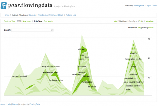
And while there is no shortage of tools available to our inner OCD, one in particular stands out in my mind: your.flowingdata.

Created by UCLA PhD candidate Nathan Yau as part of his thesis on self-surveillance, your.flowingdata allows users to aggregate personal data through daily tweets, and then visualize it in various different formats, including graphs, treemaps and word clouds.


Obviously, as a closet obsessive-compulsive and data visualization fan, I am more than a little intrigued so I've started tracking one simple aspect of my life: my moods and their intensity during the workday (since that's when I'm mostly on Twitter).

Yes, I realize I have picked perhaps the least objective metric possible, but that's half the fun. I'm curious as much about my moods as to what might affect my perception of and decision to report on them.

More updates on that to come.

In the meantime, you can read more about your.flowingdata here.
Also, here's an older post on visualizing music consumption, another cool thing to track.

Wednesday, May 13, 2009

United Sins of America

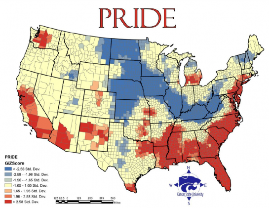
Theoretically interesting, but sketchy in its execution: geographers from Kansas State University create visual maps of the prevalence of the seven deadly sins across the U.S. using various statistics as a (tenuous) proxy for the country's sinfulness.


Lust: based on the incidence of sexually transmitted diseases. Because lusty people have unsafe sex and spread disease. Research courtesy of the Bible Belt!


Gluttony: based on the number of fast food restaurants per capita... While I definitely get the correlation between gluttony and fast food (big, cheap and FAST!), perhaps an obesity map would have worked better? All this shows to me is the homogeneity with which fast food franchises have colonized the country.


Greed: reflects average incomes versus total inhabitants below the poverty line... This one I believe is flawed. I can't think of a way of combining these two statistics to come up with a measure that would at all correlate to or even connote greed. The map too seems to indicate that they are simply equating greed with prosperity.


Sloth: reflects spending on arts, entertainment and recreation versus rate of employment... A bit uninspired, and ideologically flawed, but okay.


Wrath: reflects total violent crimes per capita. Sounds about right!


Envy: based on the total number of thefts... Seriously? San Francisco guiltier of envy than LA???


Pride: calculated as the average of the six other sins... because pride is the origin of all sins? Cop out.


So... I take it Heaven is full of mid-westerners.

Via Flowing Data and Revolutions.

Monday, May 11, 2009

The future of news visualization: Still waiting

Since my recent post about the inadequacies in current means of presenting news, I've stumbled upon another news site that seemed worthy of mention: MSNBC's Spectra Visual Newsreader.

And sure, it's visually intriguing, and surprisingly easy to use. It lets the user select specific interest areas, and then surfaces related news with a combination of text and images.


But still... I'm not convinced that translating news into a vortex of color-coded flashcards qualifies as a significant advancement in the field. It looks nifty at first, but it's not innovative in any meaningful way.

So yeah: no.

Sunday, May 3, 2009

The future of news visualization

So I've been spending some time thinking about how news is conveyed, and I'm thinking we have room for some serious innovation...

Pick up a newspaper and what do you see, at a very first glance? Words. Black type on white. An image or two. Perhaps a big headline catches your eye and you read it; it registers in your mind as Big News. You read a few more articles. Now you know a subset of today's news, but little more.

Seems to me that a whole lot of information is falling through the cracks, and online news sources are not much better. Google News tried to create a richer news experience, by aggregating news from different sources and by organizing stories topically, but it wasn't a huge improvement.

Here are a few more interesting approaches:

Newsmap.jp I just discovered today, and it's quite smart: it displays all news on a single screen, color-coded by topic, with the biggest stories occupying the most real estate. The user can either search for a specific story, or filter based on topic, recency and geography.


Another conceptually interesting news site is BreakingNewsMap, which pinpoints breaking news on a world map in real time...

Unfortunately, despite its theoretical coolness, in practice it's too scattered and conveys information far too slowly (just one story every couple of seconds), so the user gets no sense for the big picture. I could imagine idly following it for a minute or so, but I would get frustrated pretty quickly.

What I want to see is a combination of the two... I like the idea of putting news on a map, but I want to see more stories at once, color-coded based on topic, featured more or less prominently based on how much buzz they're generating. I want to be able to apply filters to my news. I want to zoom in from national/world news to local and hyper-local news. Oh, and I want images too!

All you geniuses out there, make it happen!

Tuesday, April 21, 2009

The remotest places in the world

If there's one thing I've gained from my sad corporate existence, it's a renewed appreciation for remote places. I think they appeal to the escapist side of me.

So if you're also dreaming of a little escapism from the hustle and bustle of your daily grind (can I fit any more cliches into this sentence?) then this map might come in handy.


It's a world map color-coded based on accessibility by travel, and you can read more about it here.

See you in Greenland!

Bleeding jobs

Nothing like starting the day with a little dose of depression, but this interactive map on Slate Magazine really drives the point home.

Yup, we're bleeding jobs all over the place, and you can see clearly what areas have been hit the worst.

Click here to view the interactive version.


Hopefully we'll get to see this republished once the situation finally improves.

Wednesday, March 18, 2009

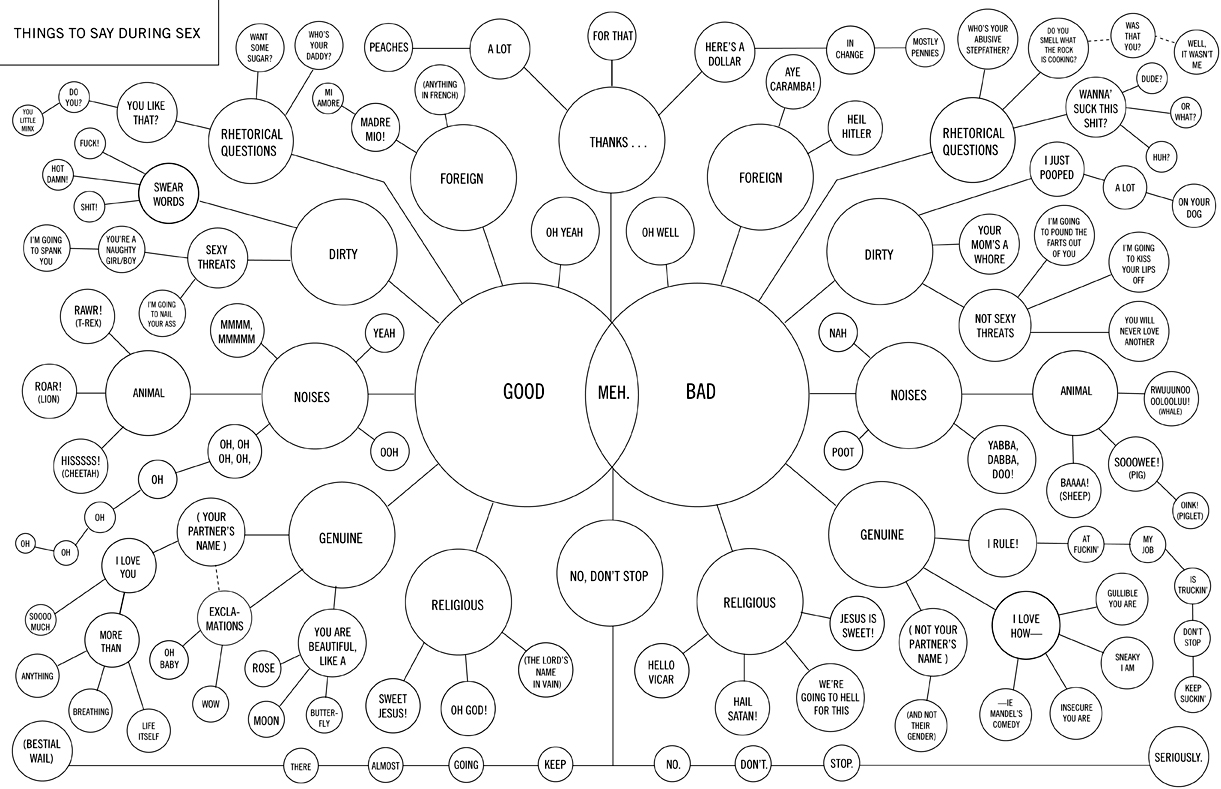
Visualizing Bedroom Banter

This may come in useful next time you're at a loss for words in the bedroom...


You're welcome!

Click the image for a larger version.

Tuesday, March 3, 2009

Visualizing the Patterns of Poetry

While browsing through Lee Byron's website, another interesting visualization project caught my eye. I've linked to his website before, on a post about visualizing personal audio histories. This one instead is about visualizing poetry in terms of repetition patters.

It always helps that Byron's visuals are so aesthetically appealing -- it makes them even more captivating. Check this one out...


It uses visuals to highlight different levels of patterns in a limerick: large yellow arcs capture the higher-level structure of the poem; narrower purple arcs capture patterns among words, like rhymes and alliteration; the bars along the bottom denote the number of syllables in each line.

If you look closely you notice even more patterns that add complexity to the visual.

I would have loved to see something like this when learning the structure of poems in grade school. Lessons on meter and "perfect" vs. "feminine" rhymes always seems so dreary and hard to remember, especially in contrast to the musical nature of poetry.

Speaking of music... I could see really interesting applications of this sort of visual to music, particularly from the Baroque period -- pieces like Bach's fugues that rely so much on patterns and repetition.

Check out more of Byron's poetry visualizations here.

Tuesday, January 13, 2009

Growth of Walmart

I told you I liked data visualization gimmicks... This one shows the growth of Walmart across the U.S.


I wish I some cool video to juxtapose to this. Like the spreading of a virus...

Click through to see the full animation in all its viral glory.

Visualizing Personal Audio Histories

I'm always a sucker for a clever data visualization project -- anything that turns an unwieldy mass of information into a clean and intuitive graphic. The "aha!" moment is my favorite.

I'm also a huge music fan so here's one that sparked my interest.
Lee Byon, an information designer at Facebook, created this graphic to map his listening history on Last.fm.


Unfortunately all I have is a partial screen shot, so definitely click through to the article to get a better view.

Here's how it works: imagine time as the horizontal axis; each ribbon represents a different artist, color-coded based on how long the creator has been a fan (cool blues represent old favorites, while warmer colors represent newer discoveries); the width of the ribbon represents the volume of music heard.

What I love is how much information is immediately apparent. First of all, I like this guy's taste in music, but he seems a little boring: he mostly listens to old favorites -- though he seems to have gotten more experimental since. His listening habits tend to come in phases: there are times when he listens to a lot of music and times when he listens to fairly little; he seems very into particular artists at certain times, but they seldom make a comeback once he tires of them.

Would love to see my own audio history graphic, and compare it to those of my friends. I'm imagining a whole world of music histories that flow in and out of each other like liquid, intersecting, affecting each others musical currents.