Showing posts with label maps. Show all posts

Tuesday, November 3, 2009

The breathing earth

This is really fascinating -- and sobering. A real-time simulation of CO2 emissions by country called The Breathing Earth. And yes, the picture it paints is pretty dire.


Worth checking out!
The Breathing Earth

Thursday, August 20, 2009

Augmented reality: The future of maps?

I have no sense of direction. Seriously, I once walked around a circular plaza one and a half times before realizing that I was retracing my steps. I always imagine that functional humans have a sort of navigator in their head that allows them to orient themselves constantly and keep track of where they are now relative to where they were before. I'm not like that. I still get lost in my office building.

Which is why I love love love augmented reality, especially as it applies to mapping services.

Map/Territory from timo on Vimeo.


This would save my life!

Via Flowing Data.

Wednesday, May 13, 2009

United Sins of America

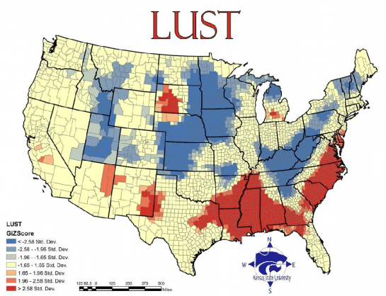
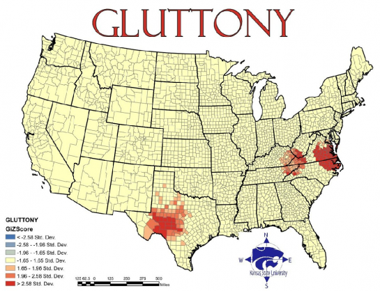
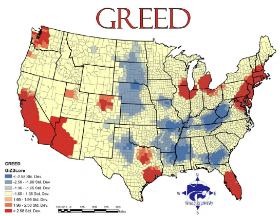
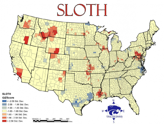
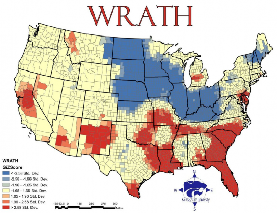
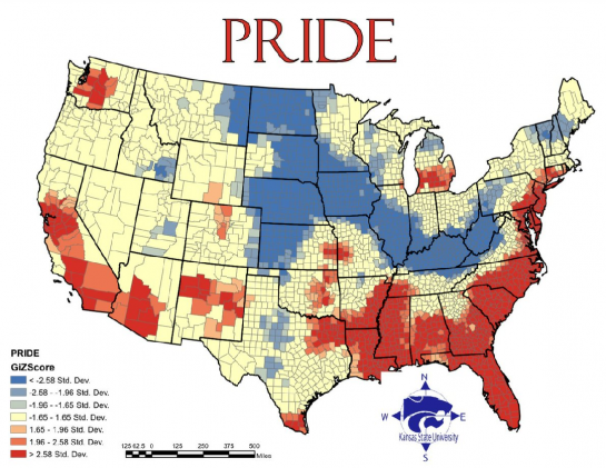
Theoretically interesting, but sketchy in its execution: geographers from Kansas State University create visual maps of the prevalence of the seven deadly sins across the U.S. using various statistics as a (tenuous) proxy for the country's sinfulness.


Lust: based on the incidence of sexually transmitted diseases. Because lusty people have unsafe sex and spread disease. Research courtesy of the Bible Belt!


Gluttony: based on the number of fast food restaurants per capita... While I definitely get the correlation between gluttony and fast food (big, cheap and FAST!), perhaps an obesity map would have worked better? All this shows to me is the homogeneity with which fast food franchises have colonized the country.


Greed: reflects average incomes versus total inhabitants below the poverty line... This one I believe is flawed. I can't think of a way of combining these two statistics to come up with a measure that would at all correlate to or even connote greed. The map too seems to indicate that they are simply equating greed with prosperity.


Sloth: reflects spending on arts, entertainment and recreation versus rate of employment... A bit uninspired, and ideologically flawed, but okay.


Wrath: reflects total violent crimes per capita. Sounds about right!


Envy: based on the total number of thefts... Seriously? San Francisco guiltier of envy than LA???


Pride: calculated as the average of the six other sins... because pride is the origin of all sins? Cop out.


So... I take it Heaven is full of mid-westerners.

Via Flowing Data and Revolutions.

Sunday, May 3, 2009

The future of news visualization

So I've been spending some time thinking about how news is conveyed, and I'm thinking we have room for some serious innovation...

Pick up a newspaper and what do you see, at a very first glance? Words. Black type on white. An image or two. Perhaps a big headline catches your eye and you read it; it registers in your mind as Big News. You read a few more articles. Now you know a subset of today's news, but little more.

Seems to me that a whole lot of information is falling through the cracks, and online news sources are not much better. Google News tried to create a richer news experience, by aggregating news from different sources and by organizing stories topically, but it wasn't a huge improvement.

Here are a few more interesting approaches:

Newsmap.jp I just discovered today, and it's quite smart: it displays all news on a single screen, color-coded by topic, with the biggest stories occupying the most real estate. The user can either search for a specific story, or filter based on topic, recency and geography.


Another conceptually interesting news site is BreakingNewsMap, which pinpoints breaking news on a world map in real time...

Unfortunately, despite its theoretical coolness, in practice it's too scattered and conveys information far too slowly (just one story every couple of seconds), so the user gets no sense for the big picture. I could imagine idly following it for a minute or so, but I would get frustrated pretty quickly.

What I want to see is a combination of the two... I like the idea of putting news on a map, but I want to see more stories at once, color-coded based on topic, featured more or less prominently based on how much buzz they're generating. I want to be able to apply filters to my news. I want to zoom in from national/world news to local and hyper-local news. Oh, and I want images too!

All you geniuses out there, make it happen!

Tuesday, April 21, 2009

The remotest places in the world

If there's one thing I've gained from my sad corporate existence, it's a renewed appreciation for remote places. I think they appeal to the escapist side of me.

So if you're also dreaming of a little escapism from the hustle and bustle of your daily grind (can I fit any more cliches into this sentence?) then this map might come in handy.


It's a world map color-coded based on accessibility by travel, and you can read more about it here.

See you in Greenland!